Location
Munich
The Pinakothek der Moderne has existed since 2002.
Originally, a Pinakothek was a museum for paintings.
But the Pinakothek der Moderne in Munich
also has other works of art.
There are 4 museums in the Pinakothek der Moderne:
• Staatliche Grafische Sammlung München (National Graphic Arts Collection)
• Collection of modern art in the Pinakothek der Moderne
• Architecture Museum of the Technical University of Munich
• Die Neue Sammlung – The Design Museum
This is why there are also 4 subject areas:
• Art
• Architecture
Architecture is about planning buildings.
• Graphics
Graphics are for example: drawings, pictures and posters.
• Design
The design determines
how an object looks.
The Pinakothek der Moderne is
in the district Max-Vorstadt between:
• Gabelsberger-Straße
• Barer-Straße
• Türken-Straße
• Theresien-Straße
Around 200 years ago, a barracks was built on this site.
It was called Türken-Kaserne.
In English, this is called “Turks’ barracks”.
It was named after the Türken-Straße.
In English, this is called “Turks’ street”.
The barracks were for
the 1st and 2nd Royal Bavarian Infantry Regiments.
An infantry regiment was a group of soldiers
who fought on foot.
During the Second World War,
bombs almost completely destroyed the Turks’ barracks.
Today, only the Türken-Tor remains.
In English, this is called “Turks’ Gate”.
This gate was part of the main entrance to
the Turks’ barracks.
It is now listed as a protected building.
After the Second World War,
the place was empty for a long time.
Then the Roncalli Circus used it for their shows for
almost 20 years.
In 1990, the government of Bavaria decided
that a large new museum should be built there.
The museum should show art from the last 150 years.
When they started planning, they asked these questions:
• How does a new building fit into the neighbourhood with
the old buildings?
• What should the rooms for the 4 different museums look like?
167 architects entered a competition to design the museum.
The architect Stephan Braunfels from Munich
won first prize for his ideas and plans.
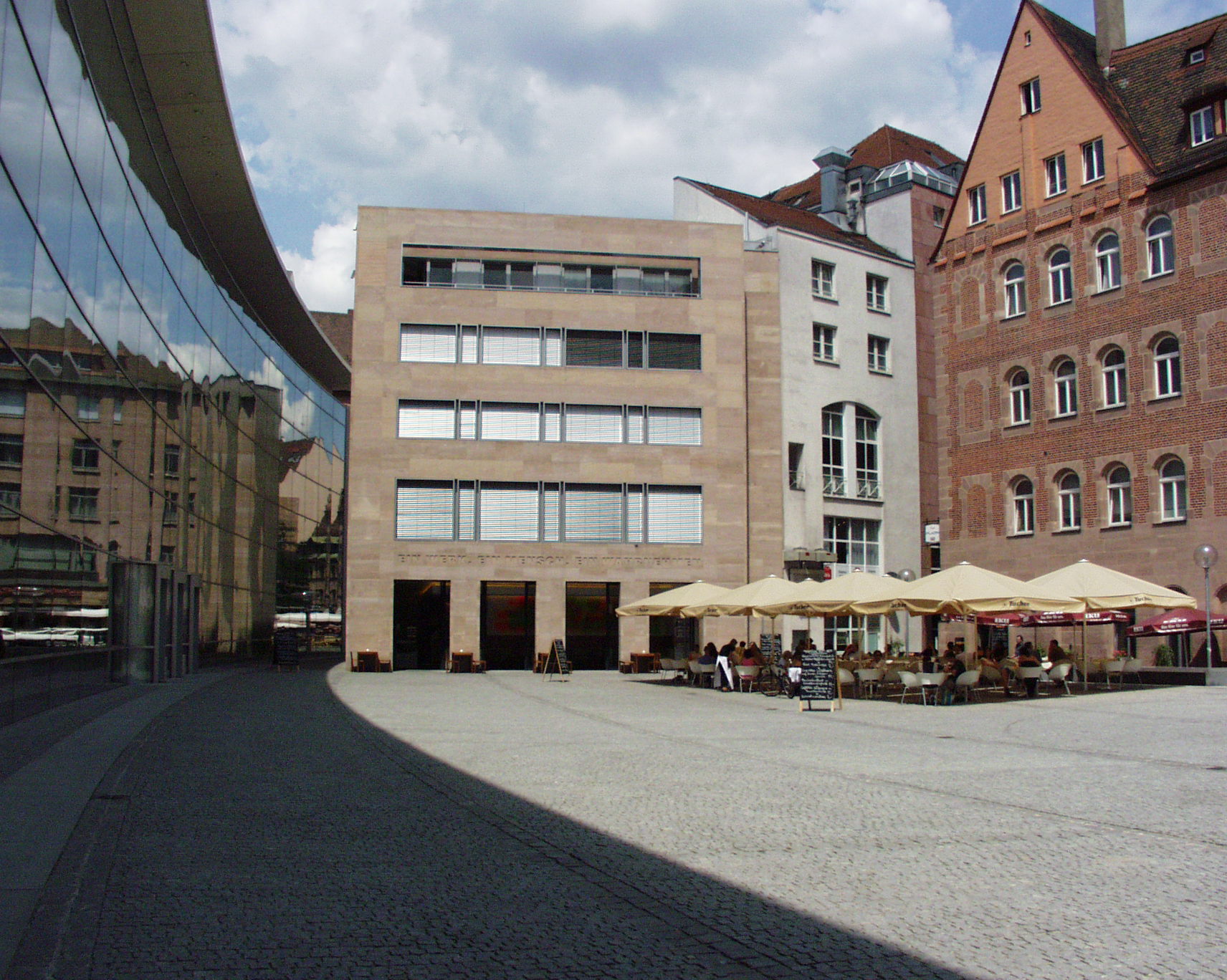
Nuremberg
In 2000 the Neues Museum of Art and Design opened in
the city of Nuremberg.
It is a museum of art and design.
Neues Museum is pronounced like this:
Noy-ez mu-seh-oom
It means: new museum.
Die Neue Sammlung and the Neues Museum work closely together.
For example, they make exhibitions together.
Their work is about what art is and what design is:
• Is there a difference?
• Are there similarities?
The 2 museums care about the close connection
between art and design.
This makes the museum different from other museums in
Germany and other countries.
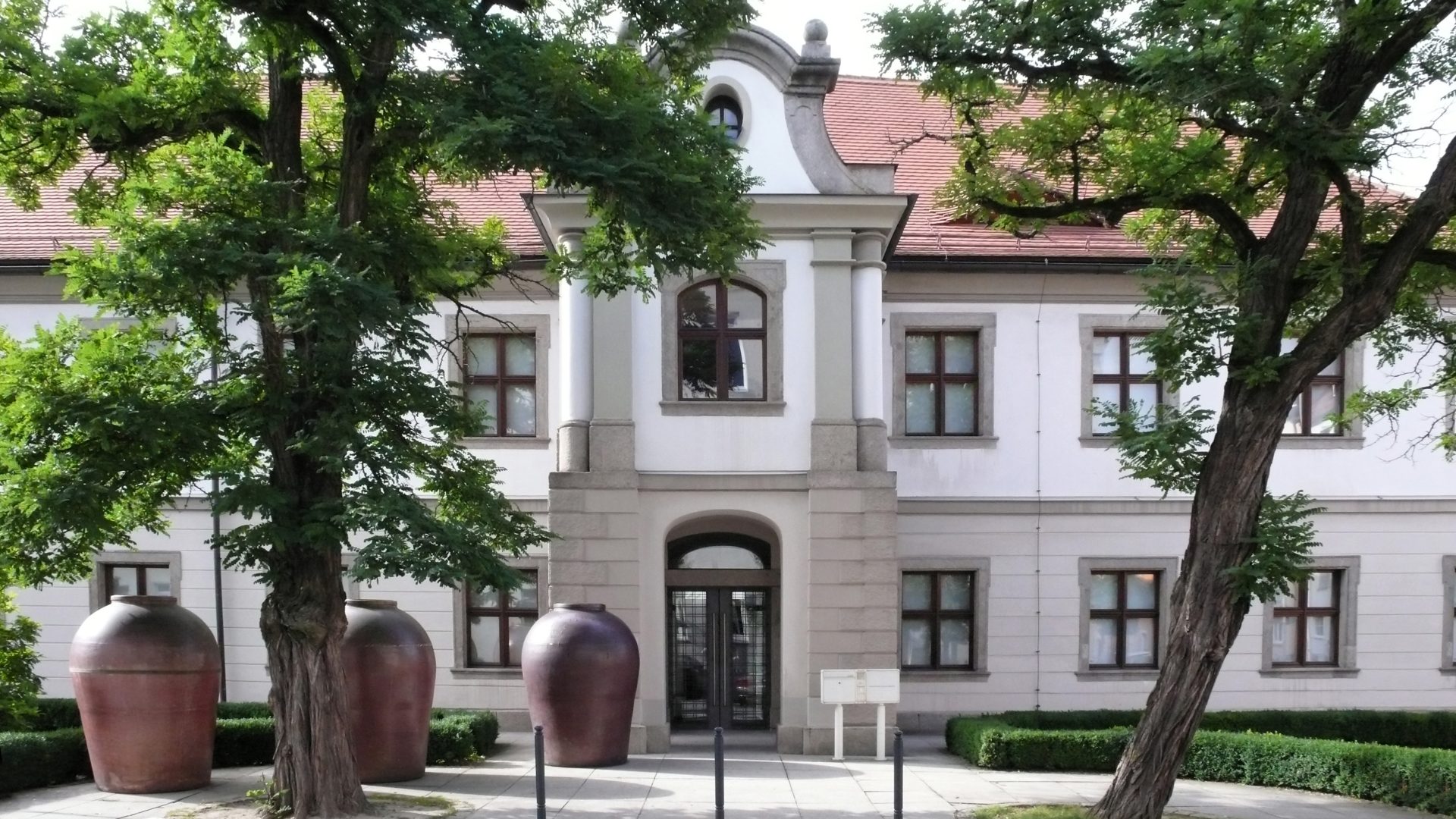
Weiden
In 1990, Die Neue Sammlung – The Design Museum
opened a museum in the city of Weiden:
The International Ceramics Museum.
The museum belongs to the city of Weiden and
the State of Bavaria.
They wanted to show the
many ceramic objects from the state museums
in other locations in Bavaria.
Die Neue Sammlung – The Design Museum
planned the ceramics museum.
This was new at the ceramics museum:
• Changing exhibitions from all state museums in Bavaria
that have ceramic objects
• Special exhibitions on various topics.
The exhibition is around 1,000 square metres.
It shows ceramic objects on 2 floors.
These are very special and important ceramic objects.
Some are 8,000 years old.
And they come from many different countries
and parts of the world.